A UI design and brand identity project for a local cafe. Based on their existing style and customer research, redesign a full package brand identity to help the cafe pop out among fierce competitors.
PROJECT GOAL
• Highlight restaurant characteristics
• Create a logo suitable for multiple occasions
• Refresh existing customer base
• Attract new attention
my role
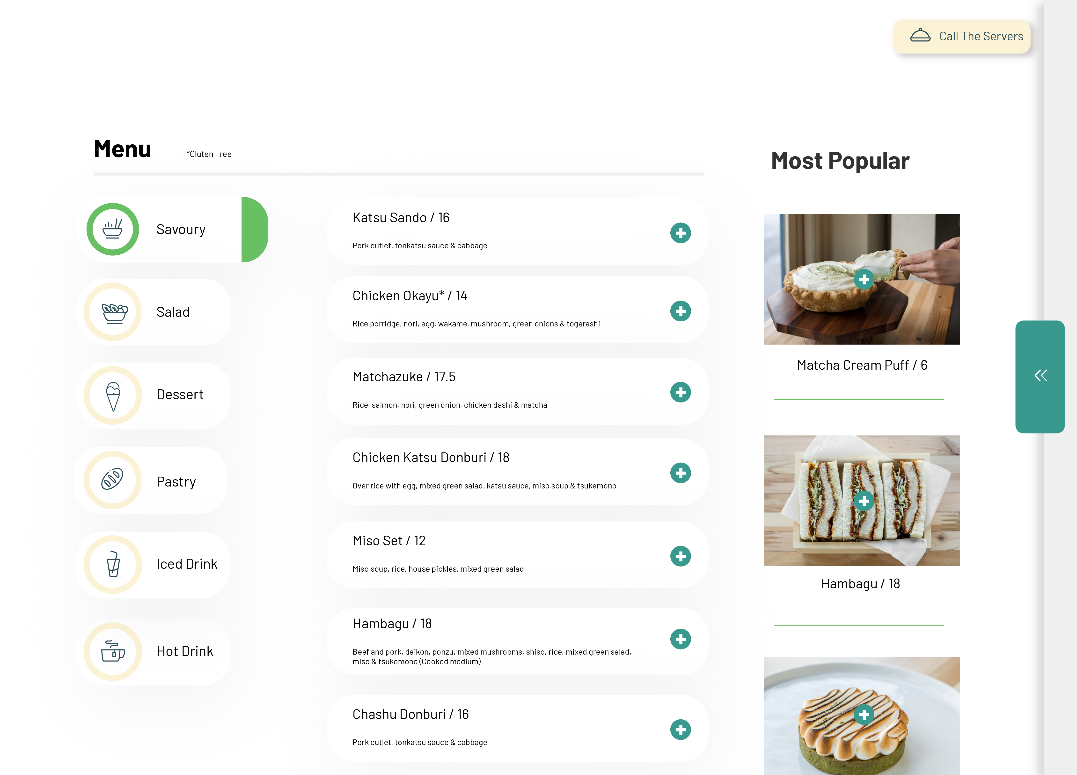
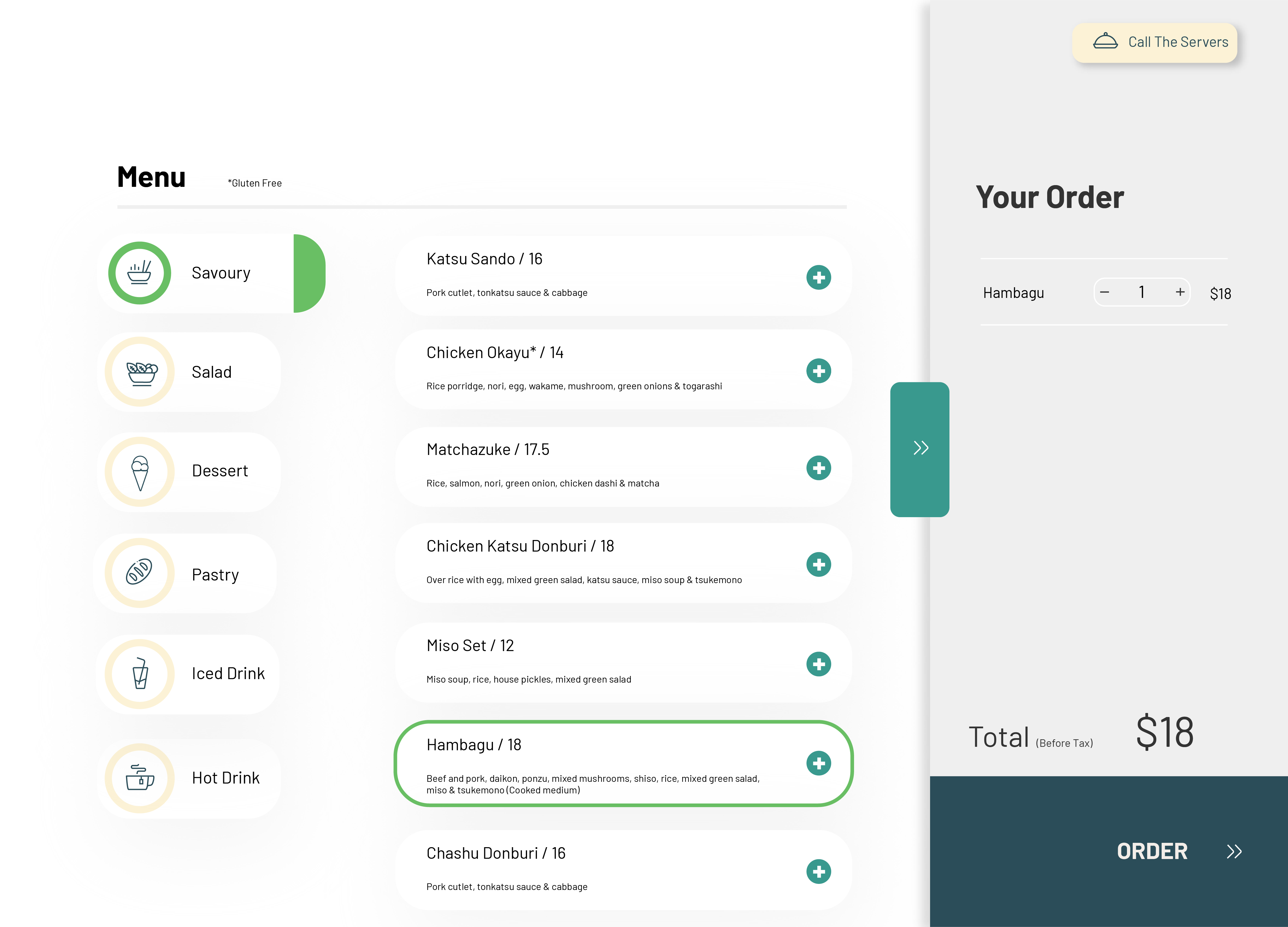
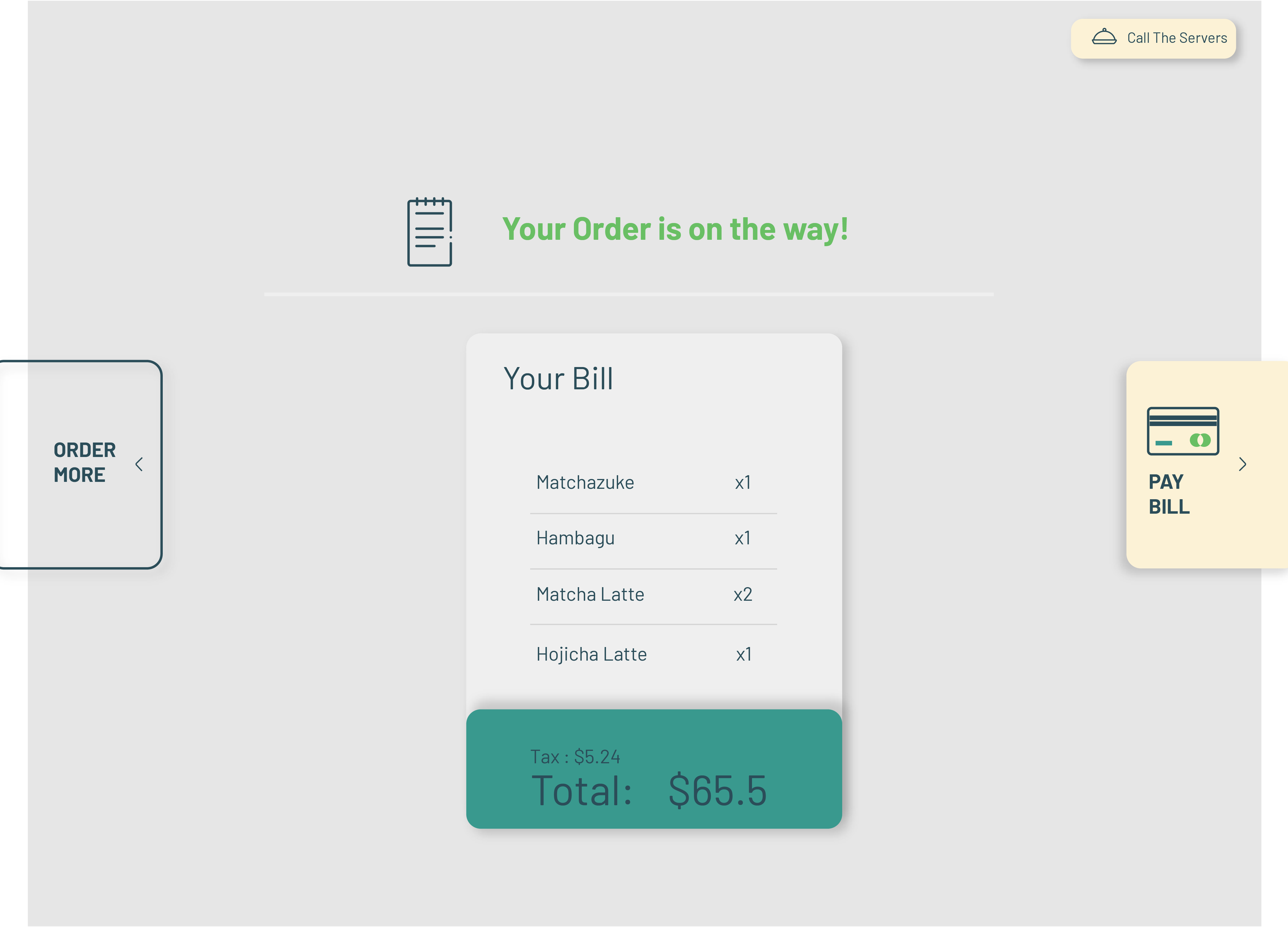
I determined the market positioning and branding style by observing the customer population and talking with the client. Redesign the logo, packaging, poster and digital menu.
The color is too dull and does not match the casual and pleasant interior style. The dull colors are not noticeable either. Although the logo design is simple, it does not reflect the core characteristics of the restaurant- premium hand-craft.
To rebrand design project. I always have Client Discovery phase after identify the problem. As a cafe with entity operation as the main business, the goal of this redesign is to understand the customer group and attract more potential customers. After research, I fount there customers have several characteristic:
Sketching a wide variety of concepts lets me see what works and what doesn’t. I’ll start to notice certain threads or themes I like, and mix and match different elements until settle on the perfect one.
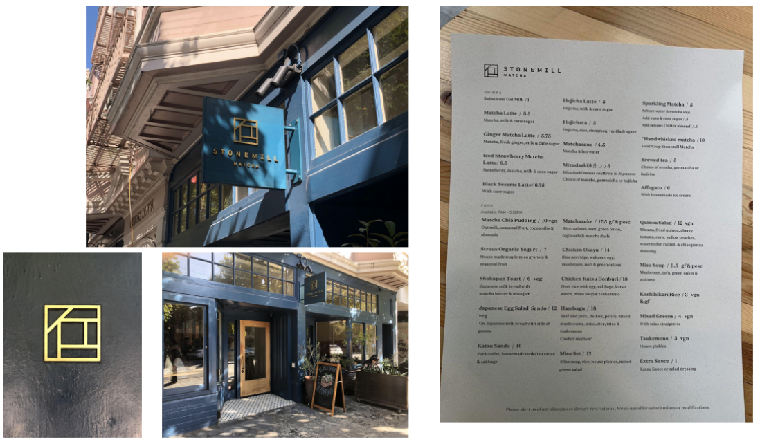
As an upscale cafe in San Francisco that specializes in hand- crafted matcha drink and pastries. The final design combined use of both unfinished stoneface and taw leaflet texture signifies the matrimony of the two at Stonemill Matcha. The Circular leaflet pattern also remind customers of the rotational milling of hand crafted matcha.
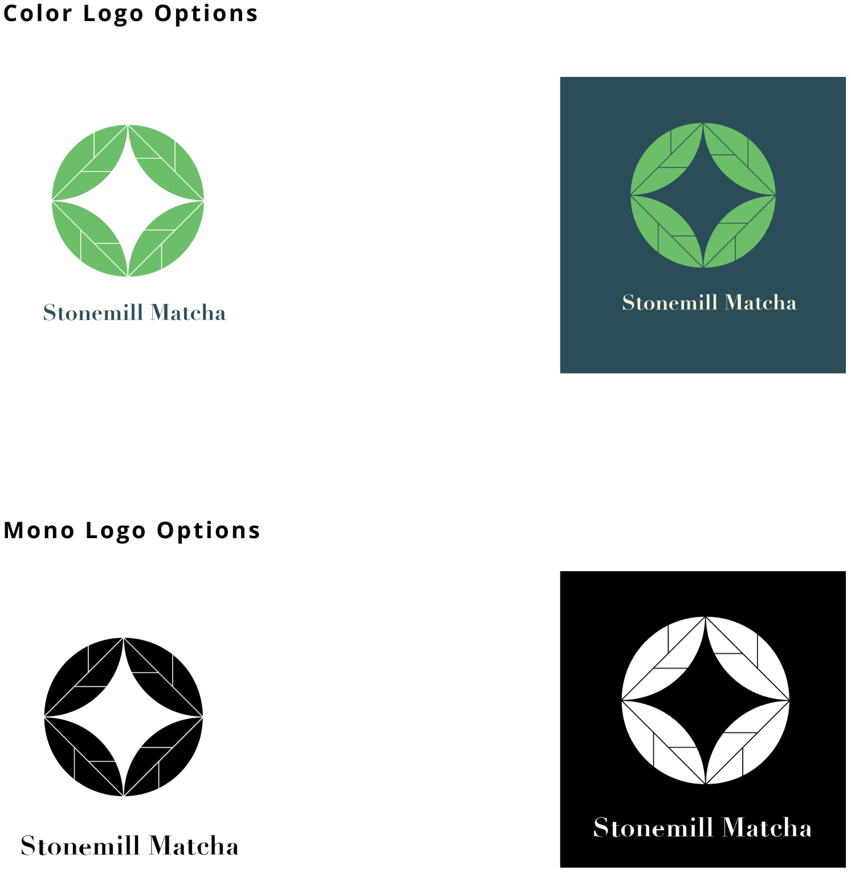

I hope to sharpen the identity of the logo, keeping it clean and elegant.
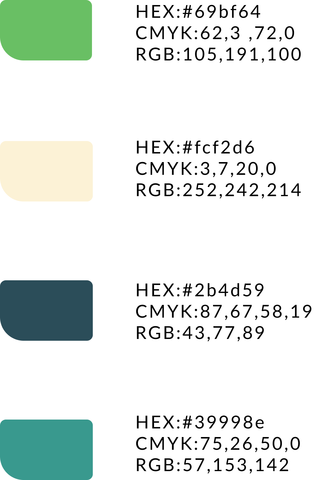
This project is a redesign project. The client itself already has a mature client base, so when designing a new brand identity, it should not deviate too much from the original. But the customer urgently needed a refresh, so the original primary color was changed to the background color, add a new accent color as the new primary color, which naturally excessively changed the brand identity.
In the design process, good communication with client in the early stage is very important. A deep understanding of brand value and positioning can more effectively design a suitable brand identity.


